Problem Statement
Collection of brands = No brand
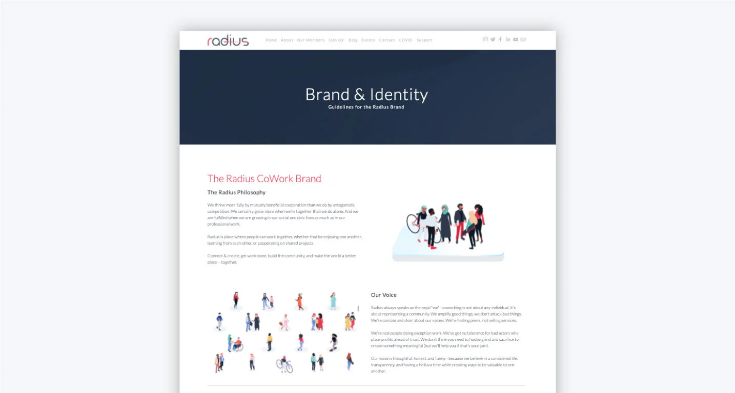
Radius CoWork is a coworking facility in Erie, Pennsylvania founded in 2015. More than just 'renting a desk,' Radius CoWork is a place where people come together to connect and revitalize the city, one cup of coffee and one completed project at a time.
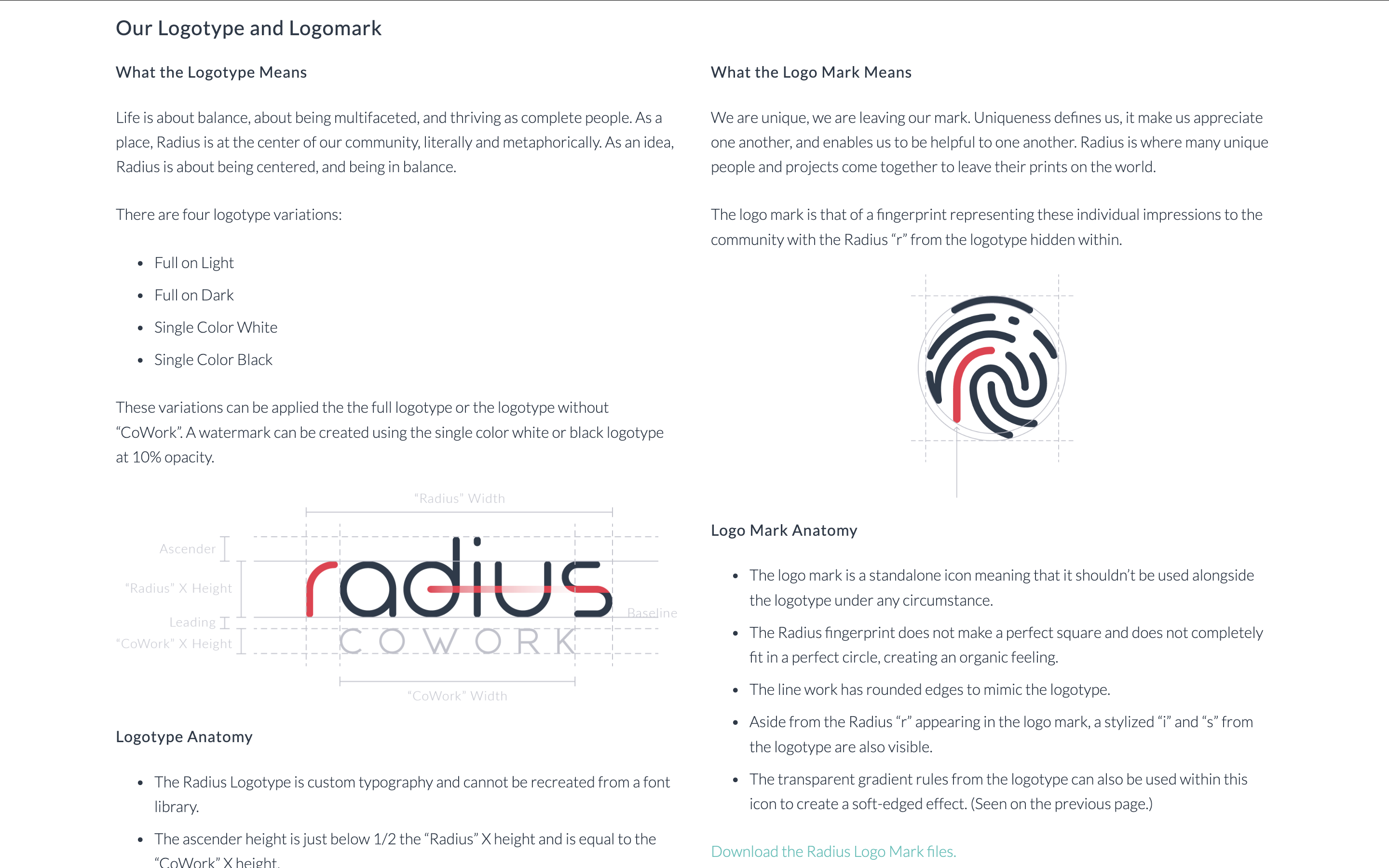
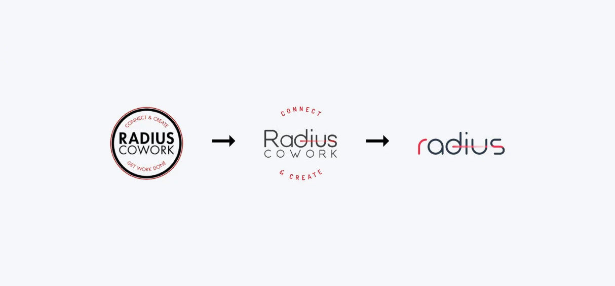
When it was founded, Radius had no brand direction. Like many startups, it prioritized a logo and nothing more. By the time Radius was solidly established, it represented numerous identities, businesses, and entrepreneurs. Radius began to look like a house of brands with no distinct identity of its own. It was time to prioritize taking another look at the goals, voice, and visual identity.
Challenges
Ever-changing community
Due to Radius' expanding reach over the short period of five years, the needs and challenges for this coworking space have fluctuated. Going from 12 members to 150+ members in a matter of years, Radius' voice continued to evolve and its brand needed to evolve along with it.
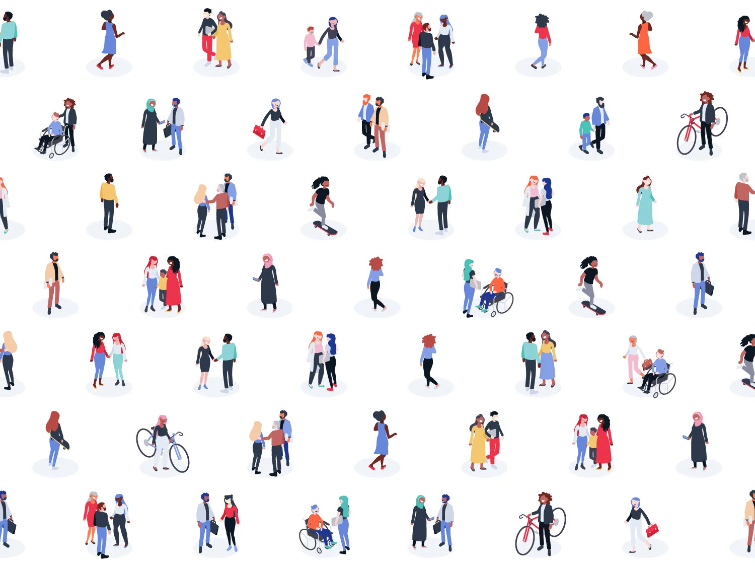
The reach grew beyond the city of Erie and into the surrounding counties and states. Thus, the Radius community became a pool or varied talent. The focus of Radius is always the people, so the vision was to represent the ever-changing community - to become a thoughtful reflection of the ever-changing individuals that make up the space.
Solutions
Designed to change
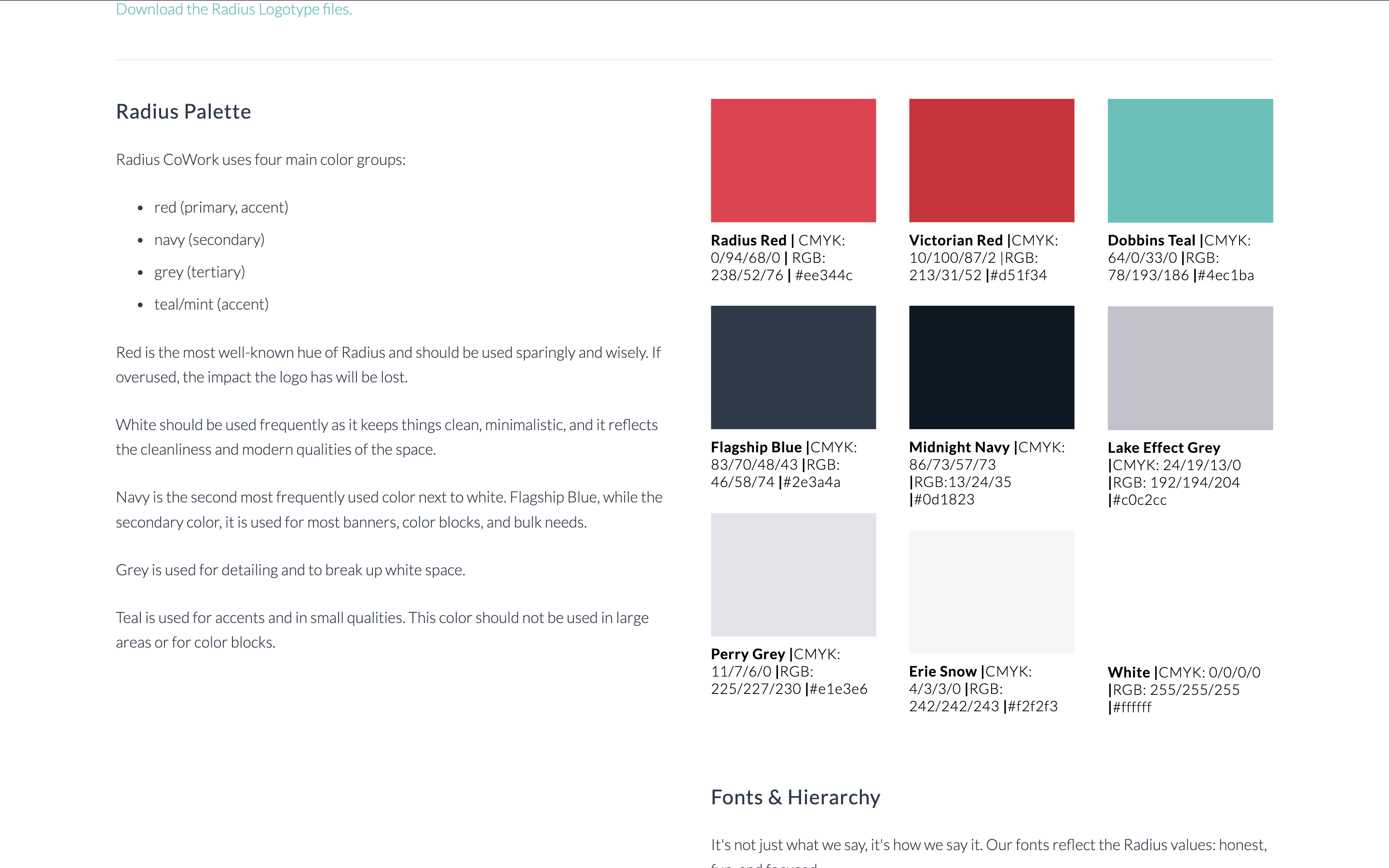
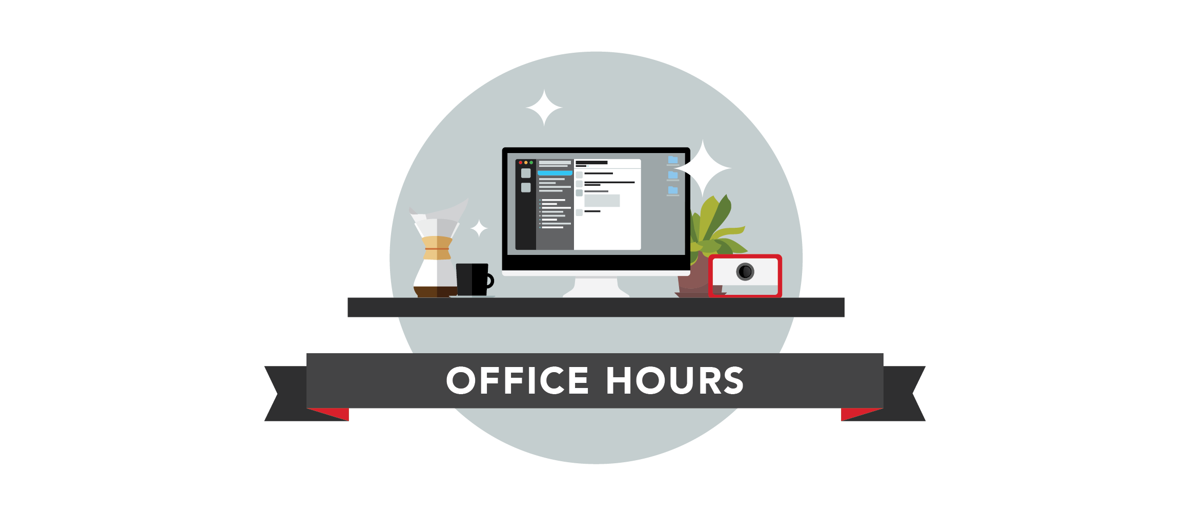
Radius' brand experience was designed with all basic tools in mind: website, email, print collateral, digital marketing, and social media. Since the physical space is a huge part of coworking, the interior design of the space was also been designed to embody the brand voice and was used to influence the visual identity. Radius CoWork builds from three main brand archetypes: Explorer, Creator, and Everyman.
This unique identity doesn't focus on solidifying its visual styles for 10+ years, but instead has a focus on community involvement and adaption. Many business owners view their brands as their babies, but Radius' owners viewed the brand as the community's baby. It was not forced to fit a voice and mission given to Radius; rather, the voice and mission adapted to fit the community.
In short, what won't change about Radius' brand is that the Radius brand will always be changing and growing with its community.
Results
A glowing reflection
Radius embodies a vibrant, light-hearted voice on social media that mirrors the community it houses and supports. Real people with real posts - no scripts. Like any genuine coworking space, Radius puts its members first with the focus on improving work-life balance in a connected and welcoming environment. The belief in the community and drive to support driven entrepreneurs built the brand. All I had to do was give it a little structure.
Businesses launched
Community events hosted
Remote jobs supported
Quality of lives improved