Problem Statement
Lack of communication in identity
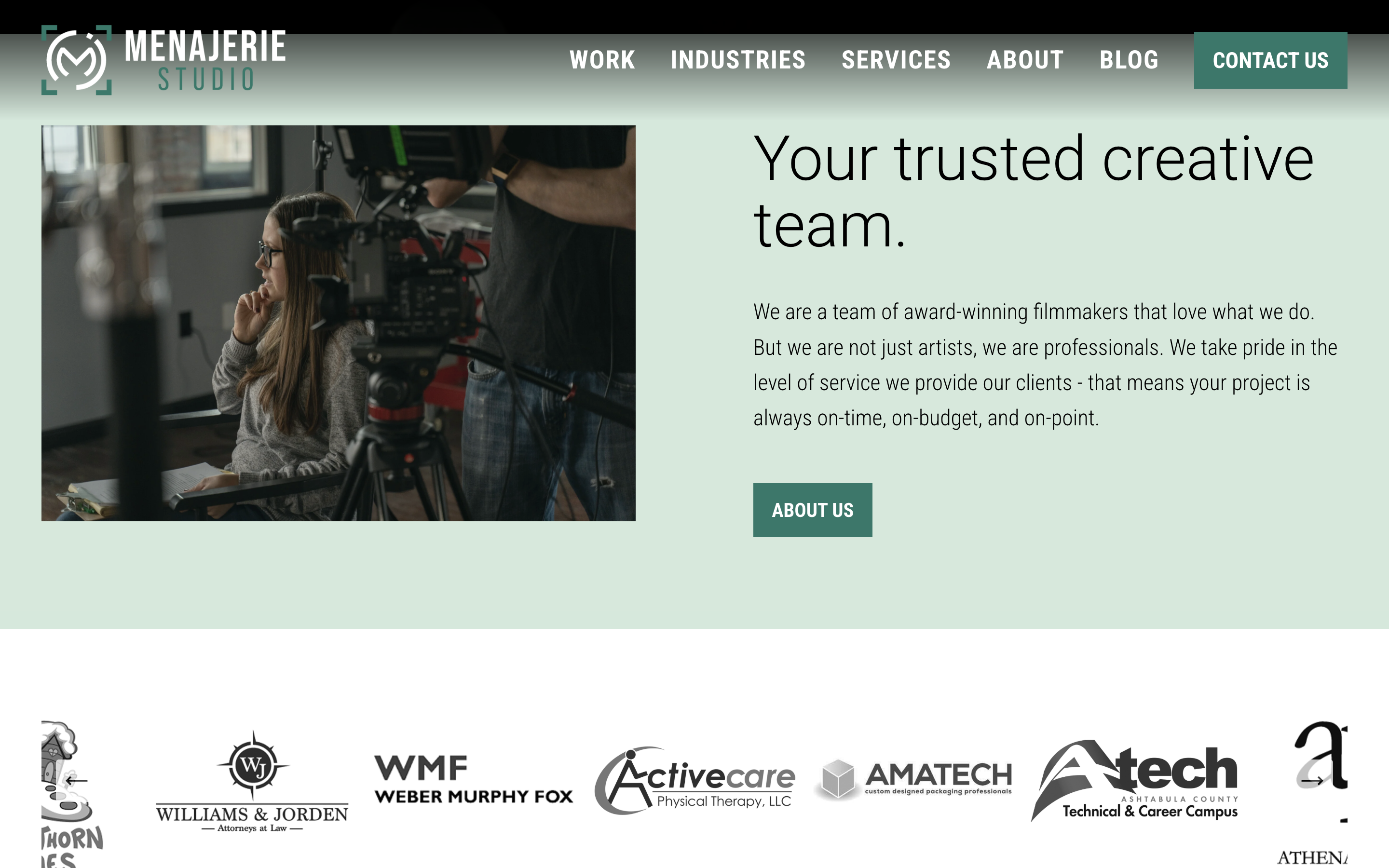
Menajerie Studio provides full-service video production as well as photography and Google Virtual Tours for businesses. They feature services such as 4k Ultra HD video recording, broadcast commercials, online business video production, video testimonials, aerial photography and videography, and more promotional advertising materials.
With Menajerie's notoriety growing, it was soon required that the branding be adjusted to better relate their services, successes, and identity.
Challenges
Small business, big clients
Working with a range of clients, Menajerie Studio has experience with small startups all the way to industry leaders. They needed their visual identity to reflect their reach and grab people the way their work does.
In video production and many other industries (related to advertising or not), the first few seconds of viewing are crucial. Menajerie leans on this to communicate what they offer through those first moments of visual impact.
Solutions
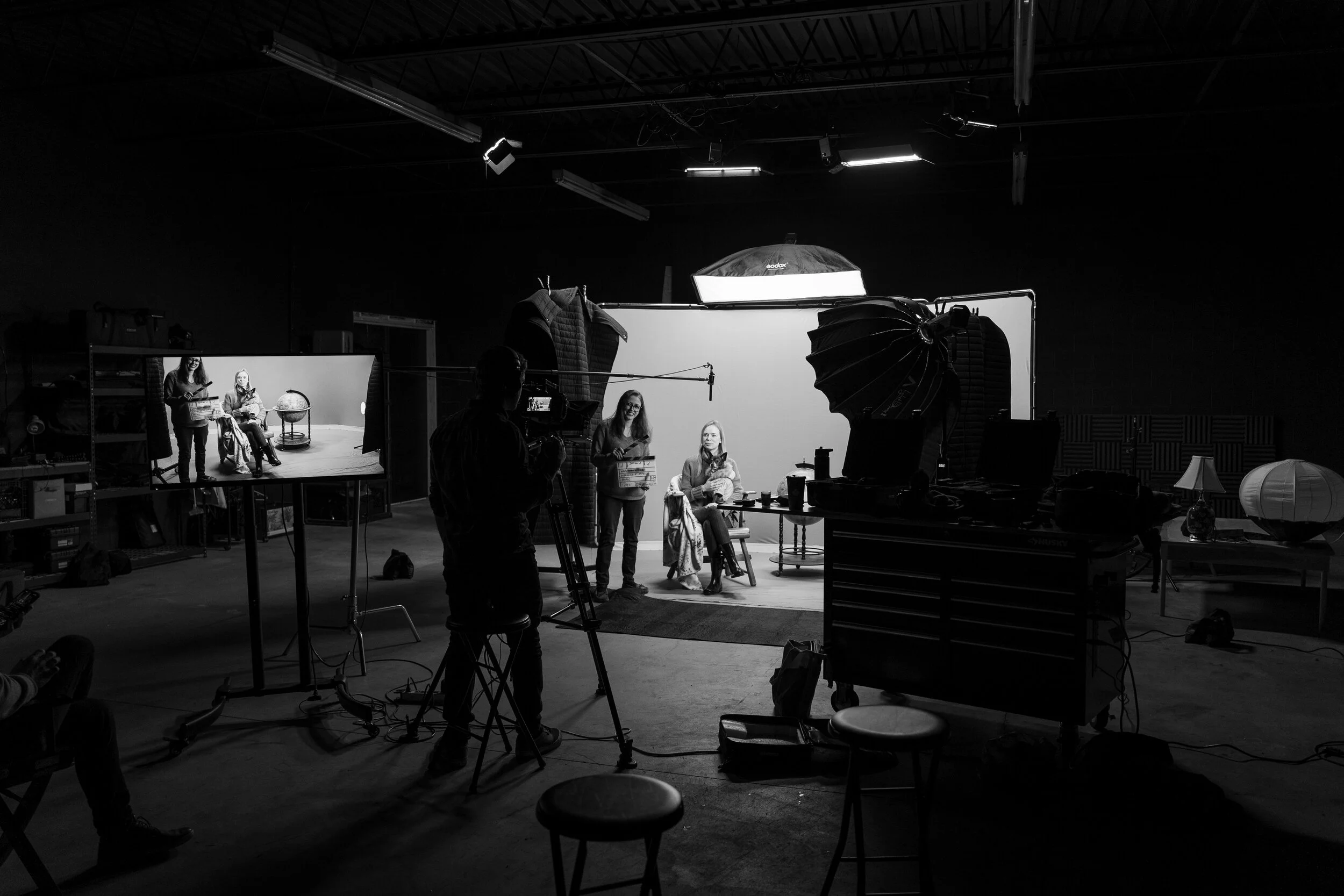
Let the work speak
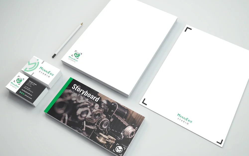
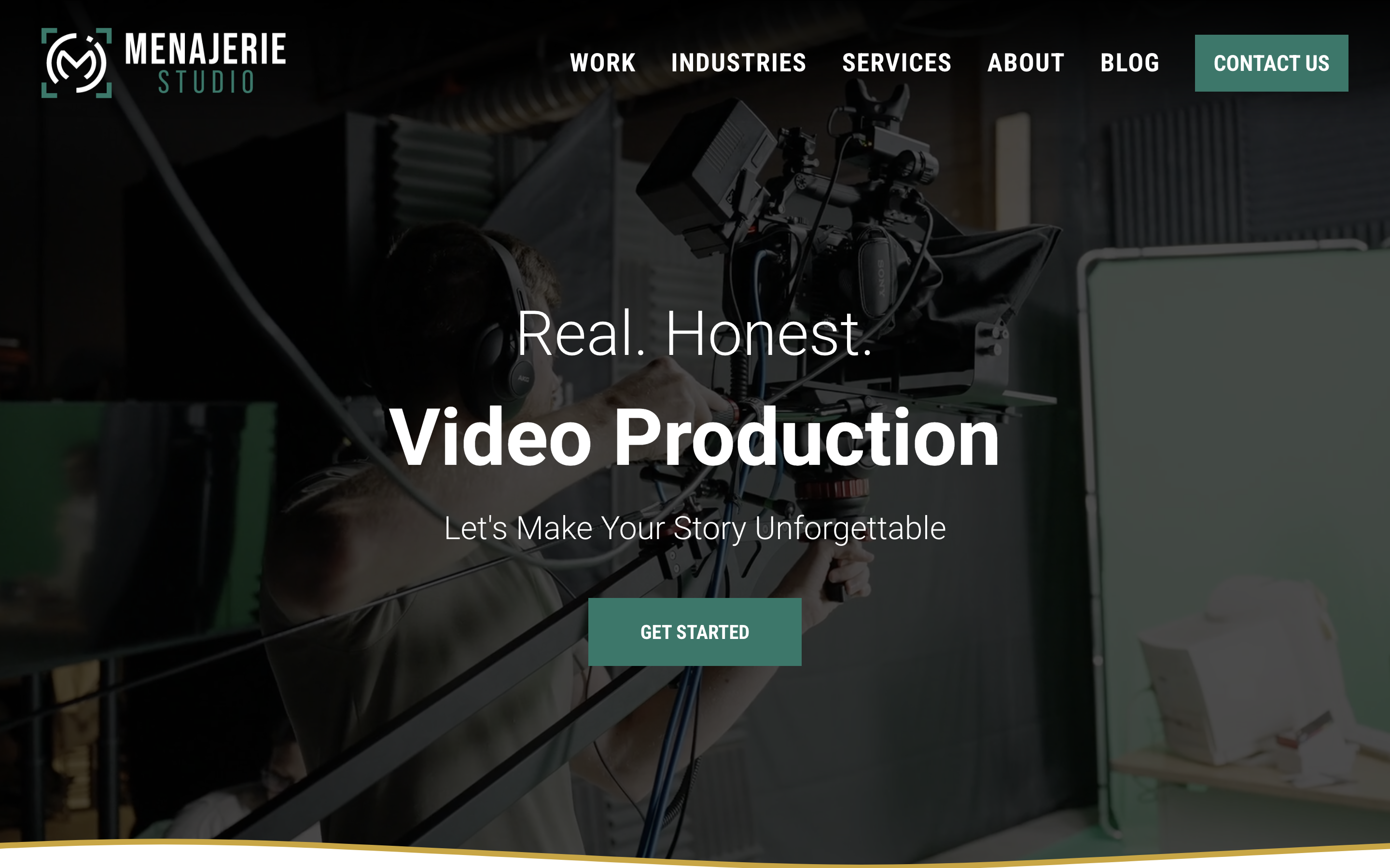
Menajerie creates high quality, intriguing visuals with everyday content. By using bold, yet minimal accents complementary to their style and physical office space, the work takes the spotlight and completes the visual experience. Like any other company with a product, it was obvious that their services be showcased – and being in the visual experience, how could we not? Their identity builds from three main brand archetypes: Hero, Creator, and Everyman.
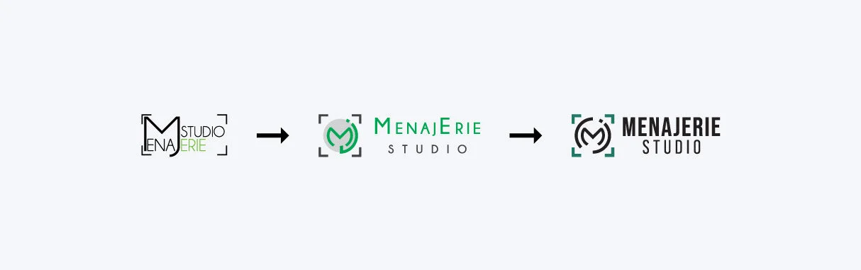
Taking subtle guidance from well-known brands like Netflix or Apple, Menajerie's logo is not overstated and does not monopolize their digital presence or marketing. There is no repetitive call out to their company name, which suggests that it isn't necessary. This small, intentional strategy subconsciously invokes a feeling of 'eliteness' or 'premium' in today's market.
Results
The best of the best
Menajerie's success has skyrocketed and the visual identity matches the high quality of services they provide. In a single year, the company moved to a new space (interior design tied with branding) which increased the physical production area significantly, updated the visual identity, and redesigned the website for a heightened user experience. The visual language of their brand name paired with how they execute it shows company maturity and confidence in their work.
Production space square footage increased
Gross revenue increased
YoY production inquiries increased
YoY video productions increased