Problem Statement
Dated and competing visual language
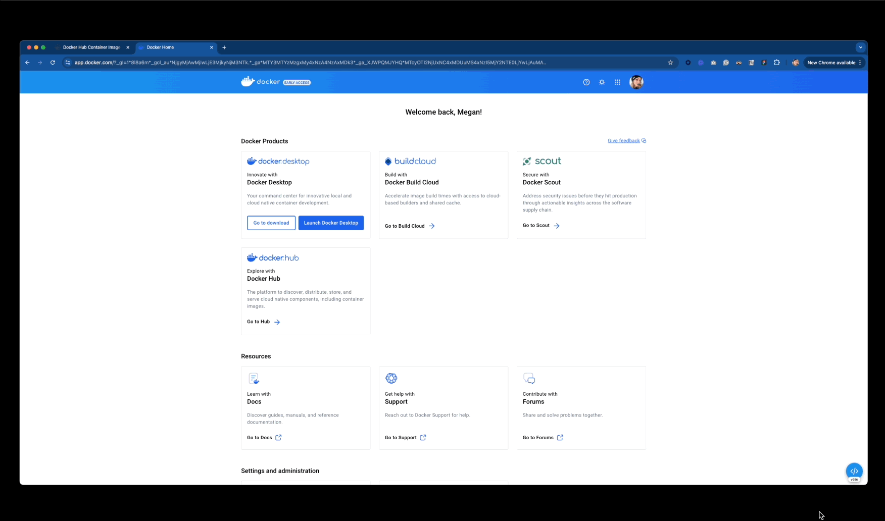
Docker's products had diverged visually after years of team-by-team decision-making without a unified design direction. Design was deprioritized in several product areas, resulting in dated interfaces, competing visual patterns, and non-designer-led solutions that fragmented the overall user experience.
The divided internal directions were carried through execution and out to the user. The tools were great, but the experience wasn't.
Challenges
Balancing familiarity and innovation
Multiple product teams operated in isolation with their own UI standards, workflows, and technical constraints. Aligning these groups required balancing long-standing developer ownership with the need for modernization.
It was also essential to preserve Docker's playful brand personality without defaulting to generic SaaS aesthetics, and retaining enough familiarity so existing user flows were not interrupted by change. The users were our priority - neither design nor developer workflows needed to be sacrificed.
Solutions
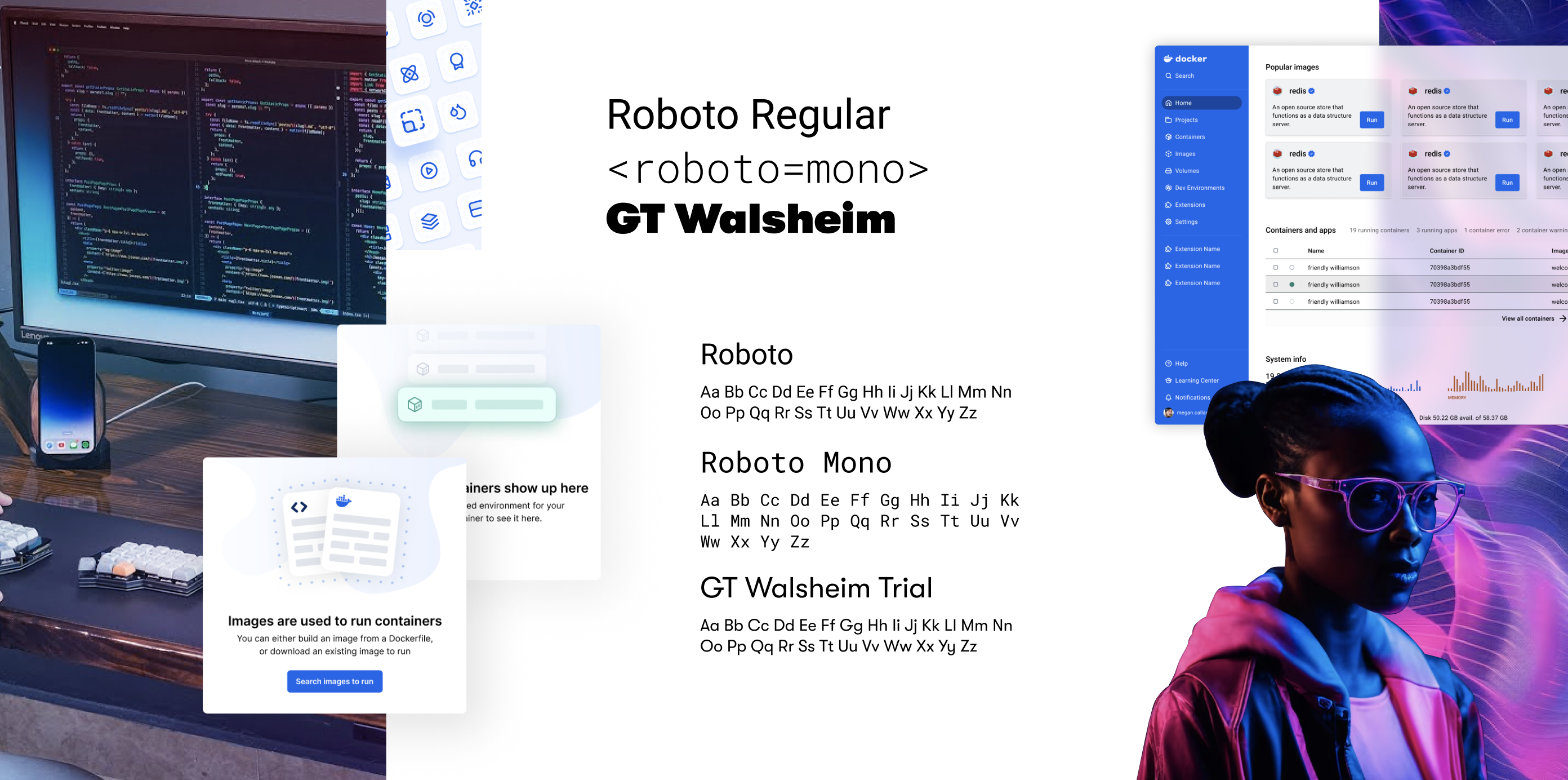
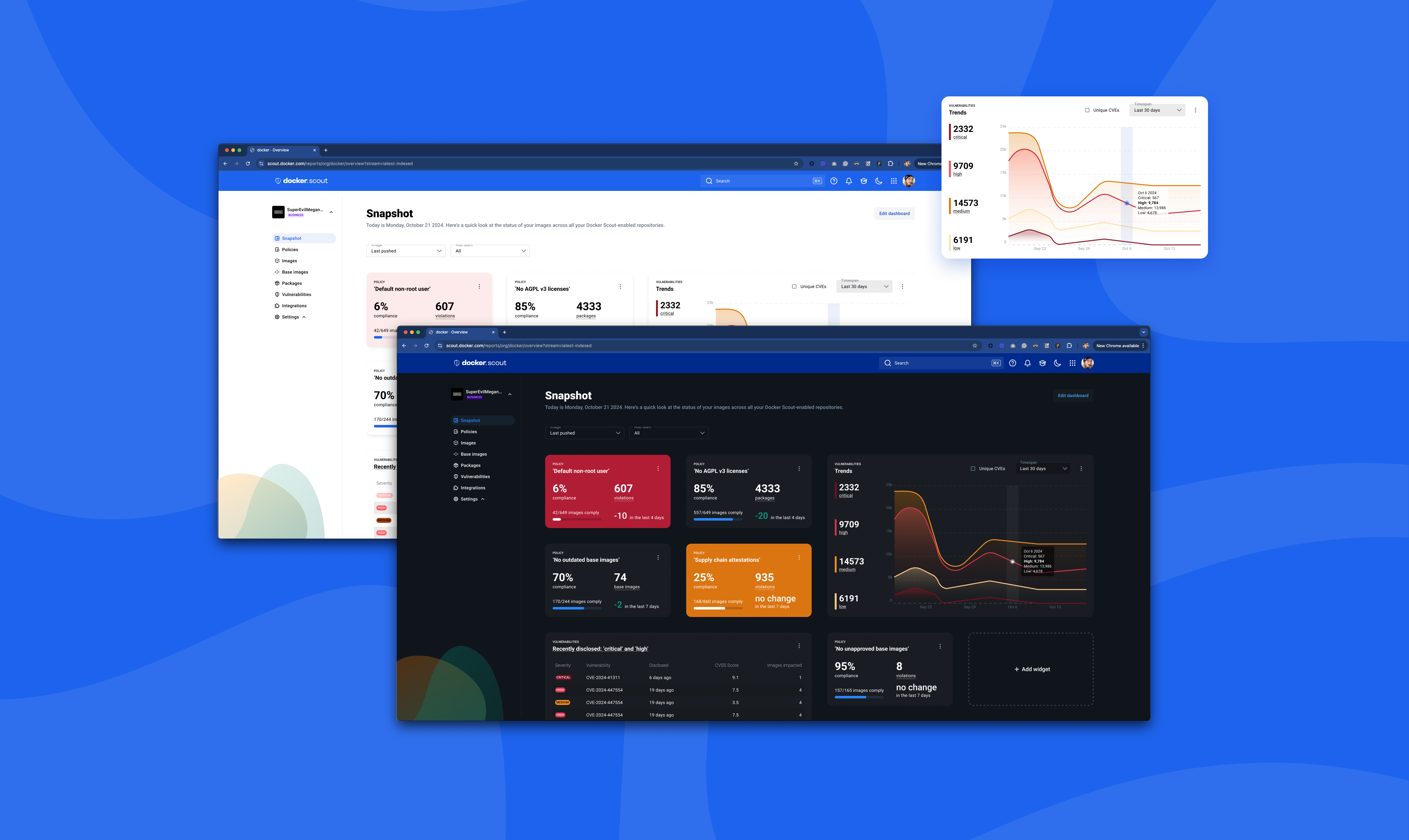
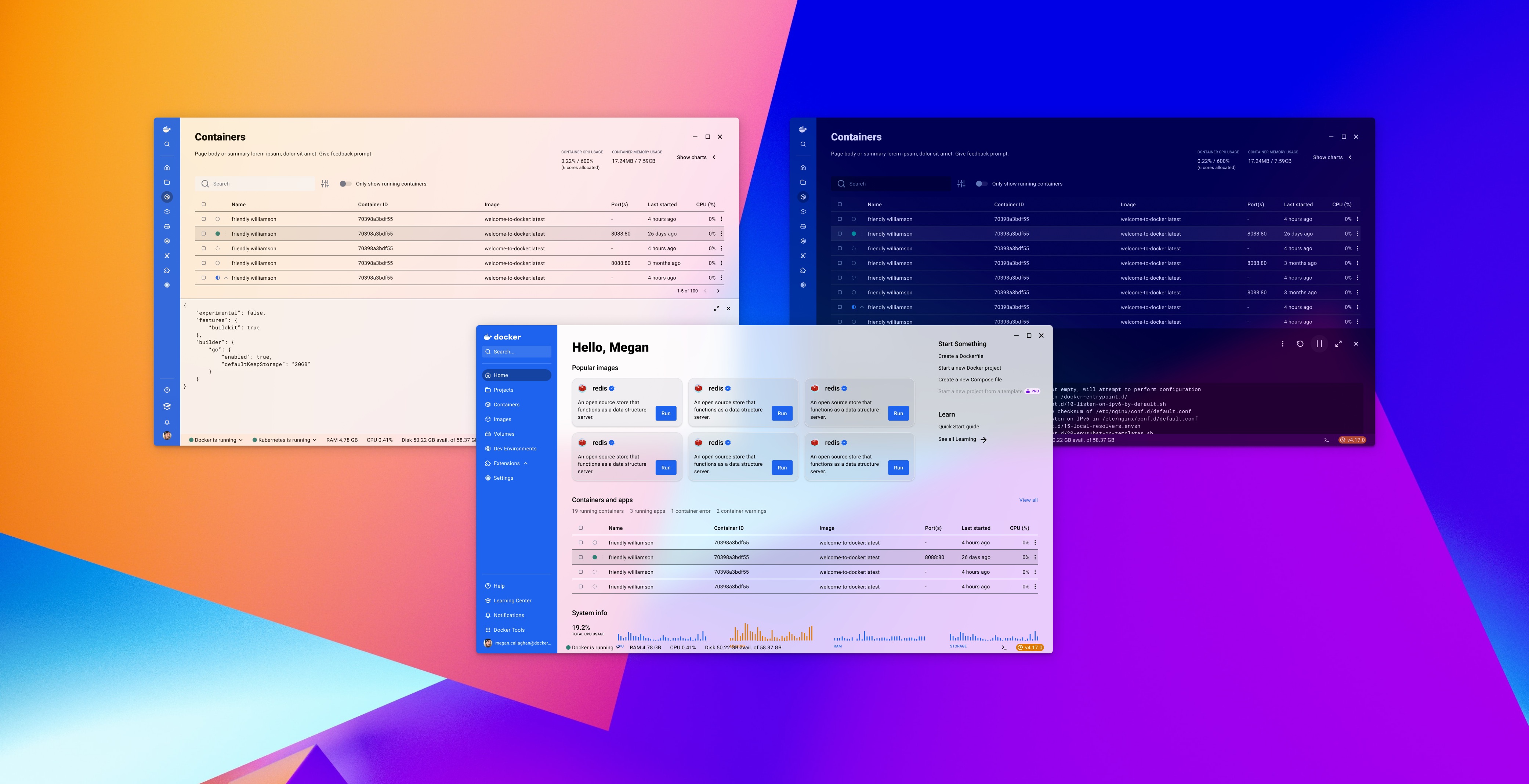
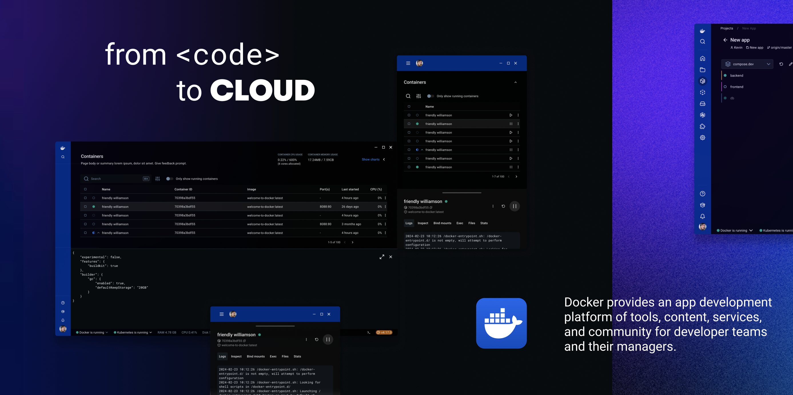
Refined, developer-focused aesthetics
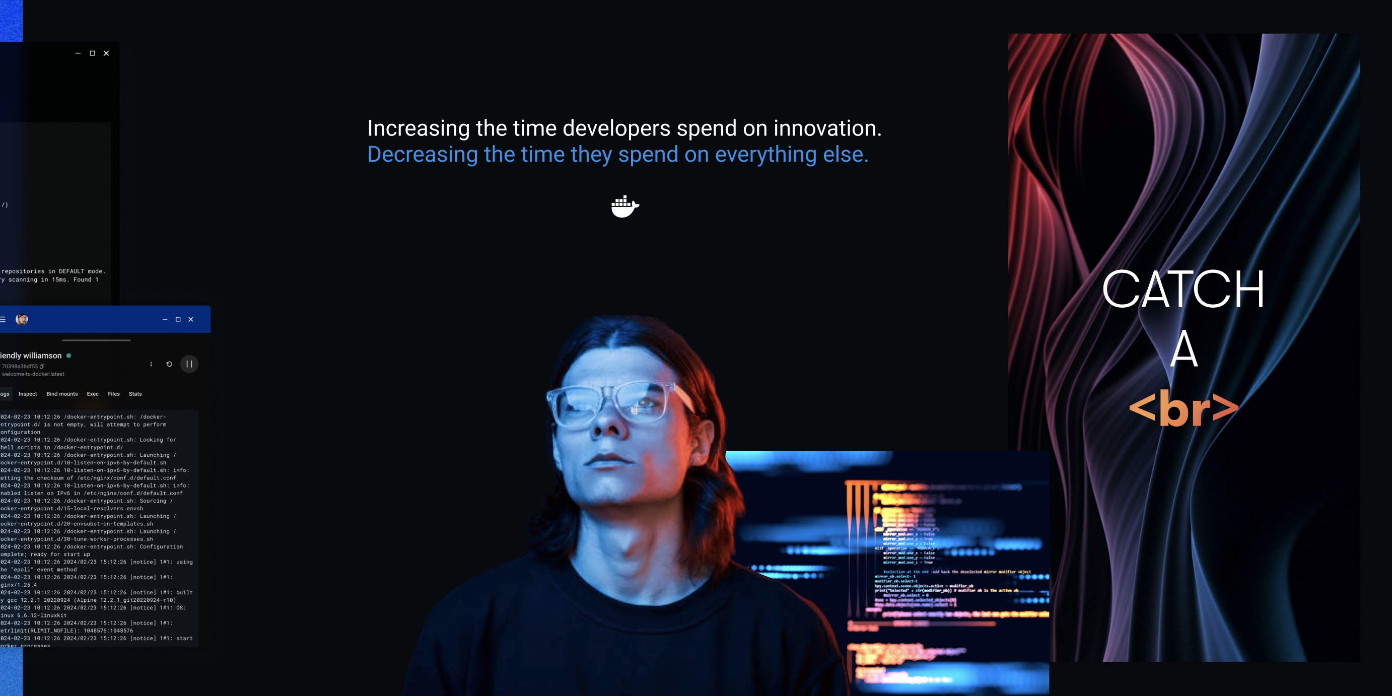
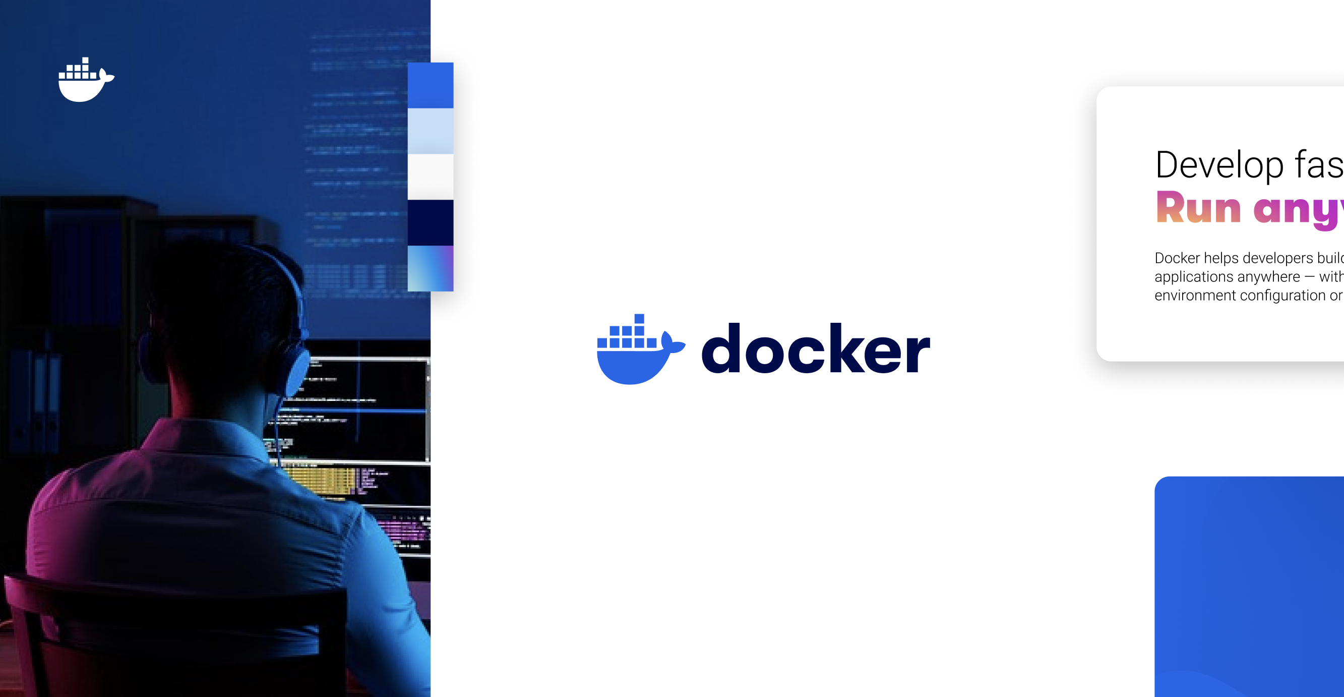
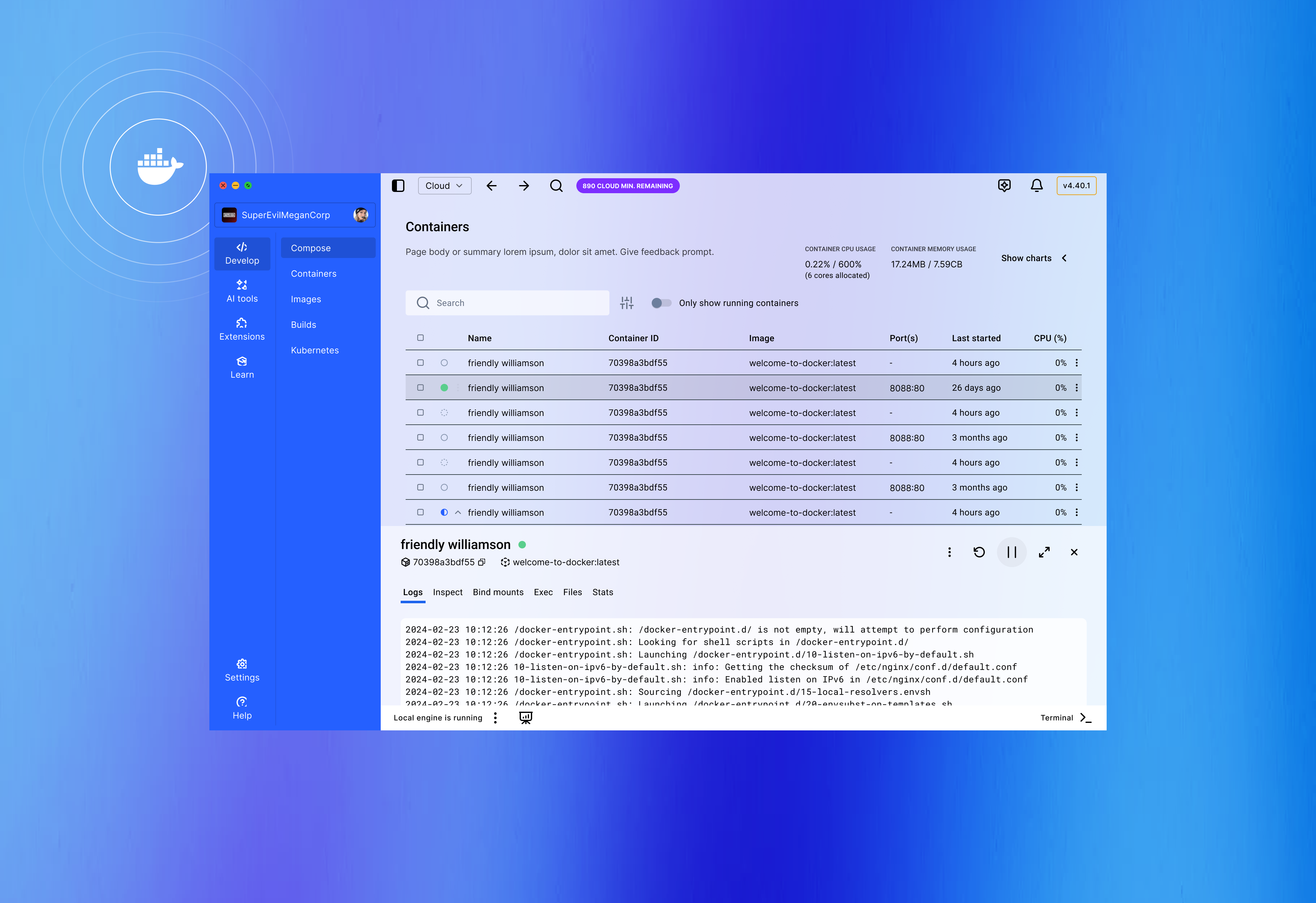
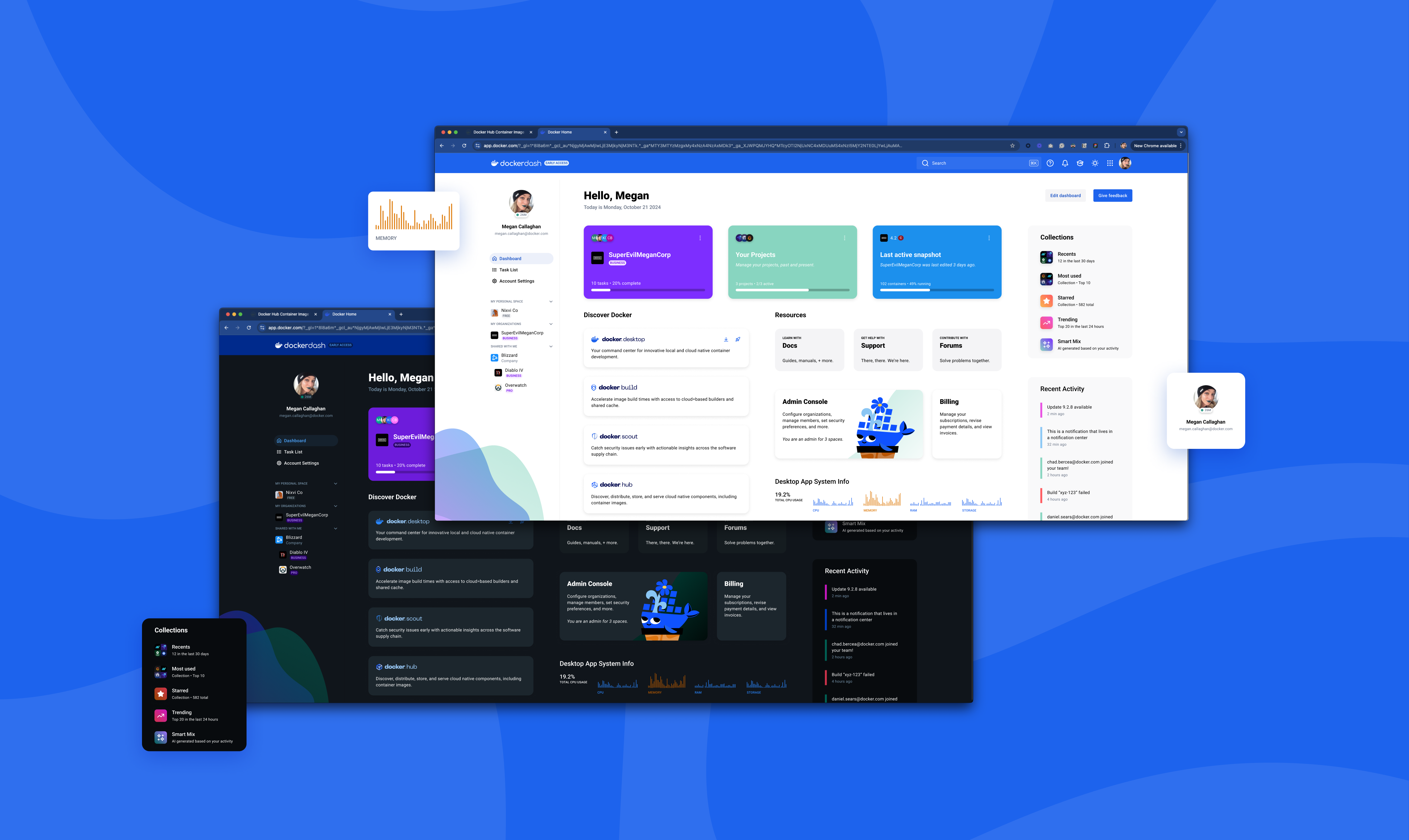
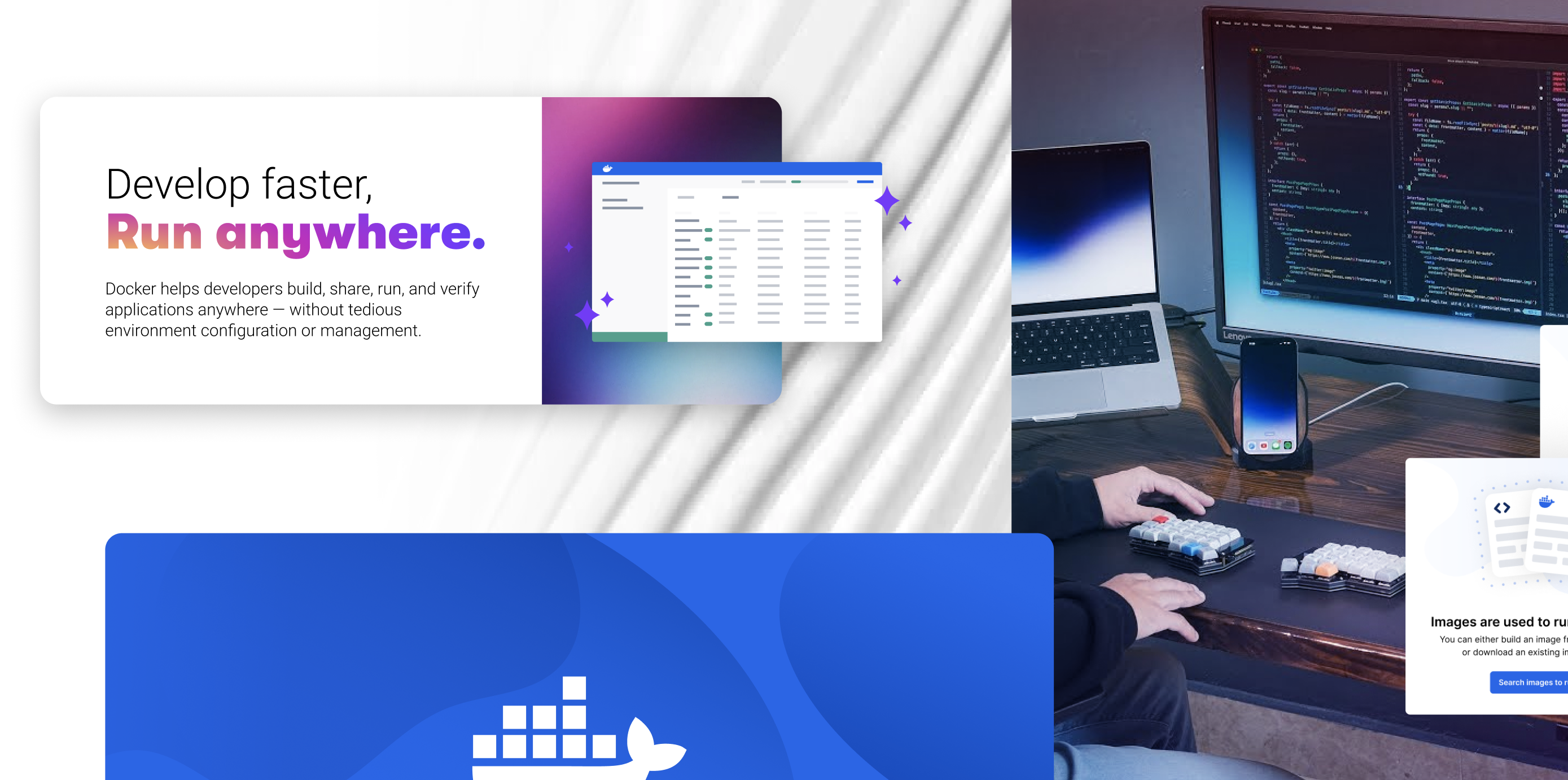
A Docker-wide visual direction proposal was developed to unify product experiences under a modern, cohesive design language. The exploration reimagined core product surfaces and included a strategic rethink of how Docker Desktop functioned as an application. It demonstrated a forward-looking UX/UI vision that balanced usability, identity, and scalability.
A refined visual direction was presented that emphasized clarity, efficiency, and modern aesthetics while respecting Docker's established brand.
The new direction introduced improved typography, refined color palettes, and thoughtful use of space to create a more sophisticated and professional feel that matched Docker's enterprise positioning. Hefty blocks of high-level detail were organized in ways that no longer overwhelmed the user or the UI while still remaining accessible.

Results
Visual language poised to increase usage
The visual direction was broadly endorsed across design, product, and leadership as a desired future state for Docker's product ecosystem. While not executed due to shifting organizational priorities and resourcing constraints, the work established a clear north star for modernization, alignment, and long-term experience coherence. From a business perspective, the direction directly addressed brand perception risk, cross-product usability debt, and long-term platform competitiveness.
Estimated internal design alignment based on cross-team review participation
Visual direction concepts explored
perceived UI modernity scored higher in internal product critiques
projected drop for cross-product visual inconsistency